Historical data. A portrait
Reading time: 11 minsHistorical data is not what you think it is and you should be careful when you use it. This is the tl;dr version of this article.
But there is of course more to it. We observe recently a particular proliferation of data science forays into the historical datasets. Isn’t that cool? But most of them tend to range on a scale from bad to very bad. It’s not like humanists make no mistakes - they do and aplenty. But there is a particular problem when data scientists start using historical data to make their claims. Things get even more dire when they apply machine learning to substantiate their claims. Why? Well, read on!
The pitfalls of “trustworthiness”
This piece will not be a simple repetition of the criticism aimed at the “trustworthiness” paper, but some points a worth reiterating. I recommend a couple of twitter threads if you want a crash course first. There is mine (sorry…) but also this one, which tackles the statistics part very well and this one which gives a very well rounded critique and this one dissecting the bias.
Let us summarise. The authors attempted to analyse how “trustworthiness” changes over time using machine learning. To this end they have analysed historical portraiture in order to identify facial features that correlate with “trustworthiness”. They found out that “trustworthiness” rises over the period of 1500-2000 and they claim that this rise correlates with “rise in affluence”.
Now, I very strongly recommend that you read the paper itself - in many ways it is its own damnation. But the main reason why you should ready it (it’s short, don’t worry) is not to make the mistake the authors of this study made: not reading your data. This paper is your data here. Read it.
Awesome. Not. Short, but necessary points on the data science part: the regression graphs are a joke. A literal joke. The “trend” they found is based almost entirely on two outliers. This would not have passed a 1-year statistics assignment. But it made it to a huge, well known journal and got reposted by numerous media.
Your data is not what you think it is
Historical data is not any data. It might look like one, even superficially behave like one, but it isn’t. And historical data stored in collections (be it museums, archives, galleries or databanks) is even less like normal data. And what historical data most certainly isn’t is big data: that unicorn of data science that is supposed to change into gold under the influence of the modern philosophers’ stone: machine learning. Leaving aside the deeply flawed assumptions about what big data can and cannot achieve (and there is a lot to unpack there) let us focus on why historical data cannot be treated that way.
No data is neutral and apart from the fanatical bigdatists (believe me, they exist) very few data scientists will dispute the existence of inherent bias in datasets. Algorithms are the equivalent of a parrot: they will repeat and amplify any bias embedded in the dataset. You might remember the Amazon hiring algorithm fiasco, which prejudiced against women and people of colour, because it was based on the hiring data that… prejudiced against women and people of colour. This keeps happening and will keep happening, because the creators of those algorithms don’t look at their data. And when I write look I mean: read. With comprehension.
Now, one can make an argument that all data is historical data. Correct. And no data should be left without its historical, social, and cultural context. In other words: scientists and algorithmsmiths cannot just willy-nilly produce 4-page papers claiming “discoveries” based on “pure data”. Context is everything, because all data is historical. Moreover, you cannot resurvey historical data. You can regather it to check if you have collected all available instances. But you cannot resurvey it.
But in this set of historical data not all datasets are the same. The further back we go the more expertise you need to even understand what kind of data you are analysing. Let me explain that on the basis of the “trustworthiness” study. The authors worked initially with the portraits from the National Gallery (n=1962) and Web Gallery of Art (n=4106).
Before we move on a short comical interlude. After literally 7 minutes in R (I have a slow laptop) we can see a nice map of their dataset. This is the Portraiture Producing World according to their selection:
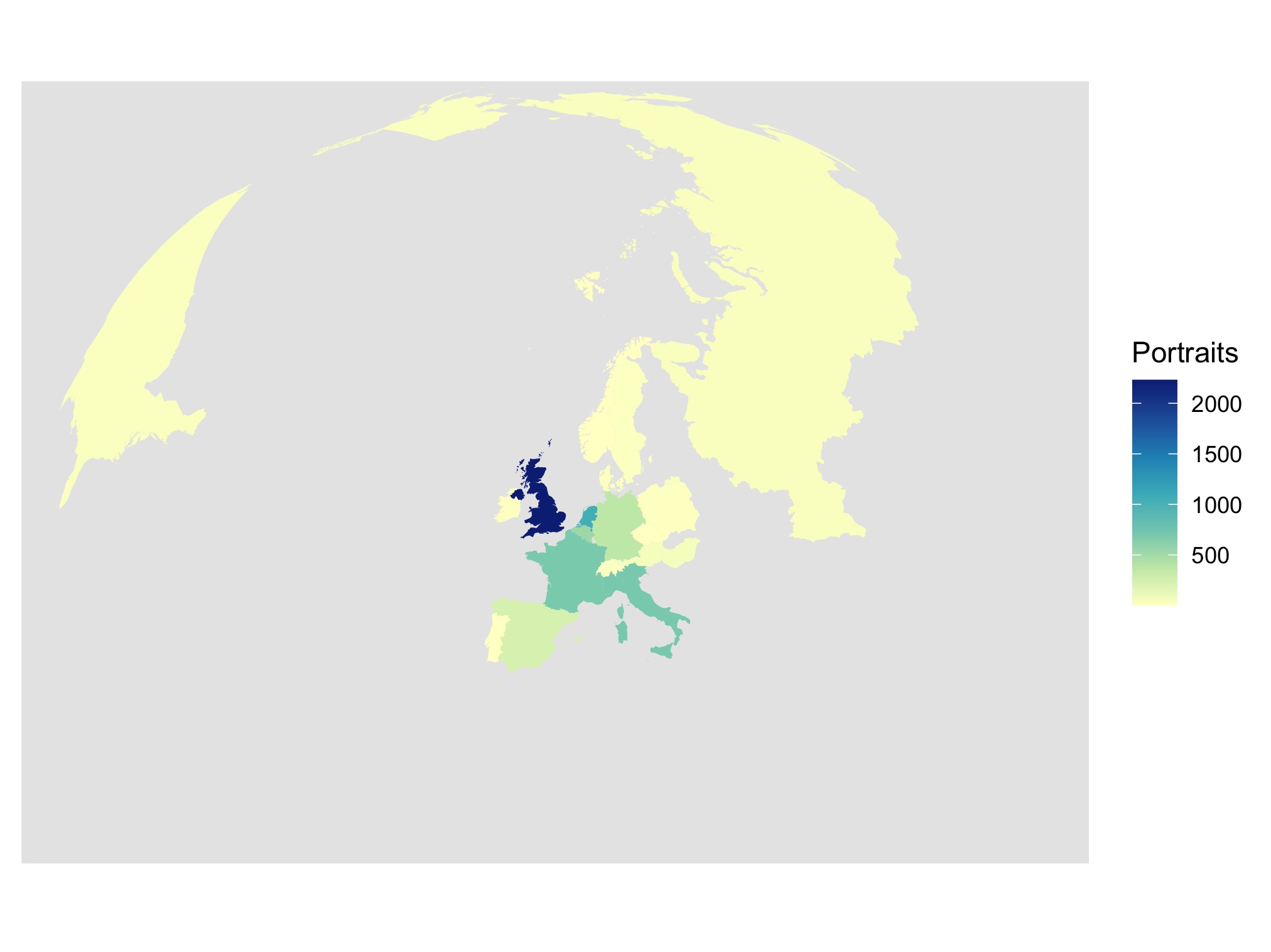
Notice something missing? Yeah, most of the globe. It gets only better from here.
Back to the historical data problem. The authors took almost 2000 portraits from the National Gallery and made them their initial playground. At no point did a red light pop up in their heads that what they are analysing is a curated collection of art. Therefore, they not only did not question how this collection was assembled, how was it curated, and what kind of fashions it reflects. Nope. But they also did not lose one blink over the fact that they were looking at a collection that has been assembled in the capital of the biggest colonial empire in history, depicting almost exclusively its white elites, and is predominantly male. They then have noticed that (I am simplifying but that is what it boils down here to) as those few powerful white men (and even fewer women) started to smile more as their colonial empire became richer, they became more trustworthy. Those findings they have then converted onto a prediction algorithm which they have applied first to the World Gallery of Art (same story, Western portraiture, 4/5 of the globe cut) and then to a world-spanning database of selfies.
Let me translate: they have taken fashions, cultural norms, and power structures of a colonial European polity into predictions according to which the rest of the world should be assessed. This, my friends, will lead you to the vast and broad desert of racial, gender, and economic bias.
Those portraits (from both initial datasets) span over 700 years. That is a solid quarter of an art history department. But the authors did not feel the need to consult any art historians. Each of the small periods in this dataset had its own norms and fashions. The art produced with those as framework contains a multitude of meanings, signals, and layers.

It sometimes takes a lifetime of scholarship to decode one of those and an enormous amount of collaboration to understand the strategies of communication within them. Each of them is comparable to others but each of them is unique.
Historical data does not consist of simple data points. Each instance, before it can be analysed, must be contextualised. And yes, this principle should be applied for all data, because all data is historical data. But if we move further in time or further from our area of expertise the gap between our intuitive understanding and the pattern of data instances increases. Similarly, the further back in time the higher the chance of data instances not surviving. The bigger the impact of curating in collections.
Moreover historical data is embedded with a high degree of vagueness and uncertainty. This is what I research now in particular (if you want to have a look at the output of our project you will find it here) and I can tell you that failing to account for uncertainty in scholarship and vagueness in the sources means that not only will you replicate the bias. You will amplify it and have no idea how it happened. This is why historical data is impossible to analyse using the quantitative methods alone. You need qualitative expertise and they both need to work in tandem.
If you think that this is limited to art history problems, well, it is not. Let us take the way in which “affluence” is calculated. The authors use GDP, Gross Domestic Product, as a way of assessing growth and “affluence”. While this indicator, developed specifically to suit capitalist economic conditions, has been already put into question as a measure of economic progress, it just doesn’t work at all for pre-capitalist conditions. The way wealth was produced, for example, in the early medieval Rhine Valley is impossible to express in terms of GDP. Transfers of wealth and property had nothing to do with capitalist conditions. Monetary economy played a different role. Symbolic economy produced wealth through intellectual and symbolic investment. (Conversely, if any economic journalists are reading this: ask a historian of early Middle Ages like me to write you a piece on how what you thought about “millennials” is wrong: they work more than you think and they produce more wealth than the baby boomers, they just do it differently). And yet, through extreme presentism, this measure has been retrocast on periods where its values are nothing more than numbers on a spreadsheet.
Historical data is not your familiar kitten. It’s a saber-toothed tiger that will eat you and your village of data scientists for breakfast if you don’t treat it with respect.
This has more consequences than you think
Ok, this is all well and good but surely, what is the actual impact of a small study looking at some paintings of old dudes?
More than you think. There is a particular bias that we have to react to “scientific novelty”. We also tend not to do in-depth reading of the press reports about those novelties. And thus what is going to remain from this paper is going to be a set of misunderstandings. Misunderstandings that are going to be weaponised against the most vulnerable. It does not take a long shot to imagine how one of the central tenets of the paper, that “trustworthiness” increases with affluence will be used against the poor people. How the fact that the basic dataset reflects almost exclusively Western and white fashions and structures of power will be used to bind “trustworthiness” with those features. And to attack marginalised communities. This paper will be used to make racist and classist claims. This paper will be picked up in bad faith to champion a particular vision of history precisely because it misrepresents it. I doubt, even more, I am sure that the authors did not intend that. But they have failed to foresee it and this is a data science sin that we keep on seeing.
The misuse of historical data is highly dangerous. First of all, because of its high complexity and difficulty in analysing the biases are difficult to spot. It takes a trained historian of art to notice the intricacies and differences between the portraits used. It takes an experienced economic historian to understand and explain why the measures of GDP do not fit pre-capitalist societies and that a sizeable chunk of those portraits has been created in times when something like Gross Domestic Product makes no sense. Finally it takes a good historian of historiography to point out and analyse the history of the social science works used in this paper, like Über den Prozeß der Zivilisation by Elias. (Conversely, it doesn’t take a specialist to at least ask if maybe a work published in 1939 by a sociologist, however brilliant, has been commented and critiqued upon especially in its strong bias towards Western culture).
So, what now?
Does this mean that historical data is off limits? Will we never see shiny visualisations of royal networks, maps of manuscript production, 3D reconstructions of mighty castles? On the contrary! Historical data is a great land of opportunity. There are countless projects that produce amazing results. The key is to cooperate with experts. This is not a revolutionary call. Just, quite simply, ask your friendly neighbourhood humanist about that set of portraits you want to analyse or that idea about economic growth or that 80-year old study of Western progress you want to reference.
Even more importantly: if you can amplify humanists, their work and their critique in the public sphere, do it!
Make humanist expertise more exciting than badly done regression graphs.
You can follow me on twitter for more of This Sort of Thing @Calthalas
Cite this post:
Fafinski, Mateusz "Historical data. A portrait." History in Translation (blog), 29 Sep 2020, https://mfafinski.github.io/Historical_data/.